SUBJECT Feedback notes: (FRENCH)
* Add colour coding to words to make it easier to see and digest.
*Caption videos next time.
* add more to grading [French]
(optional)
* Colours maybe too bright
{Reviewed by my mother, Lucas Zhen,
& Aliza Khan}
SUBJECT Feedback notes: (ENGLISH)
* Very accessable
* key words highlighted
* text is spread out
* Have separate pages
*a little more pictures
* design is consistent enough
{Reviewed by Jerry Wang} & My mom.
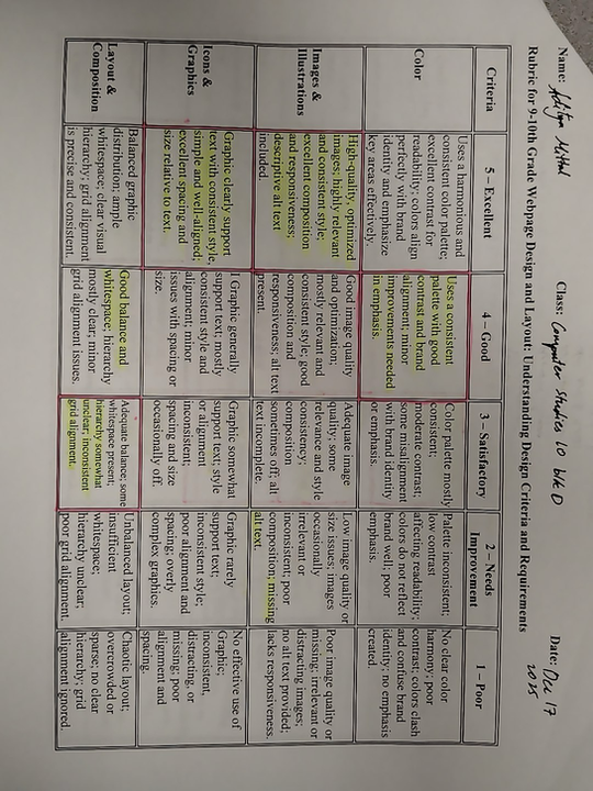
NEWS PAPER FEEDBACK (BY: EXCEL)
Feedback : From presentation (by Jessica Bai)
Colour: 4 contrast palette, too bright sometimes
Images: 2 need relevance, blurry
icons: 4 lot of icons, - relevance
Layout: 5 pretty good, boxed
typography: 4 clear and readable but sizing a bit off
Text alignment: 5 left aligned
tone and content: 5 concise writing and CTA and bullet points
interactions: 5 CTA good, images are somewhat relevant
title: 5 conce and relevant
intro:4 good but could add transition sentence
body1: 5 covered topics and detailed and reworded and bolded/highlighted
body2: 5 covers info, and relevance
body3: 5 includes outcomes and outlines skills learned
body: 4 relevance but culd be more specific on
conclusion: 3 could be more formal, some didn't have conclusions
style: 3 language is clear, needs more 3rd person in articles


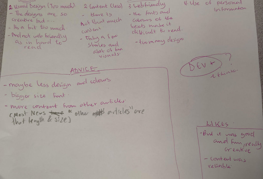
Feedback : From presentation (by Ahmad a-man) math
Colour: alright homepage and subject page 4/10??!?!
Images: wtf?
icons: add more
Layout: 4/10? Bro... headline and footer dont count
typography: jargon free ok highlighed points
Text alignment:
tone and content:
interactions:
title:
intro:
body1: clear
body2: good (jobs thing)
body3: good (jobs have income)
body4: good
conclusion: good
style: semi formal bt make more formal (eg .....). 89/100
Feedback : From presentation (Adityn Mithal) socials
Colour: good and clear
Images: add alt text
icons: arrows work but make sure it doesn't overlap
Layout:
typography:
Text alignment:
tone and content:
interactions:
title: basically perfect
intro: very great portrayed
body1: good
body2: good (job things)
body3: good (Incomes)
body4: good
conclusion: good
style: change to third person and less jargon/ grammatical mechanical issues 89/100